Designing Directly in Squarespace. Why I Skip Traditional Wireframes
When I start a new website project, I usually begin with a quick sketch on paper. Nothing polished. Just rough blocks, notes, and layout ideas. This step helps clarify structure, not visuals, and it stays loose on purpose.
From there, I move straight into Squarespace.
I do not create full wireframes in Adobe or Affinity for website layouts. Flat designs look neat, but they fail to show how a site behaves. A static layout does not scroll, does not respond, and does not reveal spacing, hierarchy, or how content adapts across screen sizes. Clients end up reacting to an image rather than a working system, and important issues only surface later once the site starts being built.
Designing directly in Squarespace removes this disconnect.
I use Squarespace as a design tool, not only as a build platform. Working inside the system from the start lets me see what is possible and what is not. Every layout decision reflects real constraints. Fonts, spacing, image handling, navigation behaviour, and mobile layouts are all visible immediately. There is no guesswork and no redesign stage caused by features that do not translate.
Years of daily Squarespace work mean I know the platform deeply. I understand its limits, its strengths, and where custom solutions make sense. This allows me to design quickly while staying realistic.
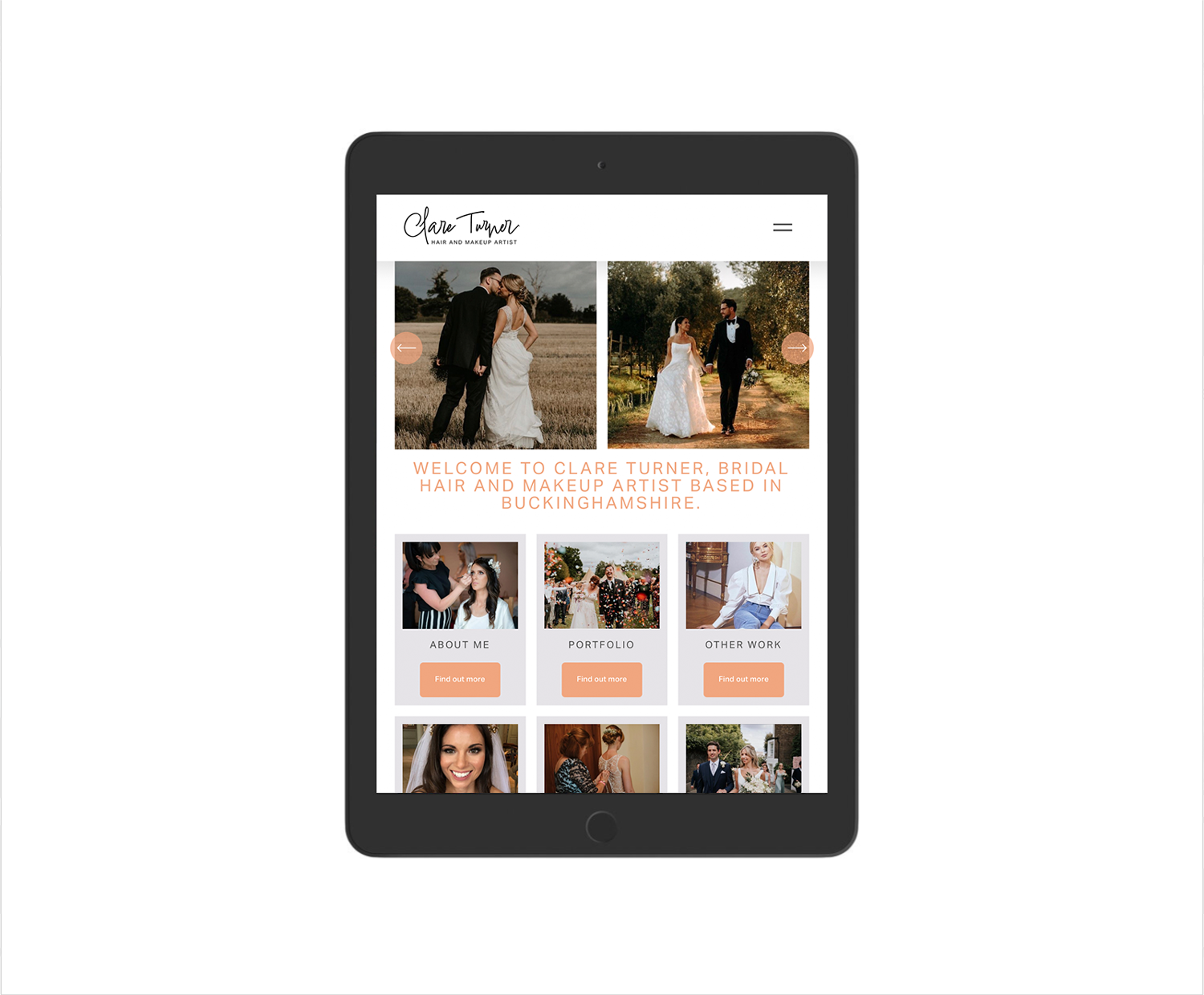
The first stage of a project focuses on direction. I build the main navigation, design the homepage, and usually design one key internal page. Fonts, colours, and images go in from the start. I also use real copy rather than placeholder text. Proper wording changes how a layout feels and helps you judge tone, clarity, and balance far better than filler text ever will.
This stage acts as a live design prototype. You view the site as a real website, not a concept. You scroll, resize, and see how it behaves on desktop, tablet, and mobile. Spacing, rhythm, and flow feel natural because they are already real.
I share this version early so feedback stays focused and useful. We refine layout, structure, and presentation together. Once the direction feels right, the rest of the site follows the same system, which keeps everything consistent and avoids late-stage surprises.
Logos and icons sit outside this process. Those assets work better in dedicated vector software, so I design them separately using Affinity or Adobe, then integrate them cleanly into the site.
This approach keeps design and build aligned from day one. You see what you are getting early. Changes stay efficient. The final site works because it was designed to work from the start.
Work with a trusted Squarespace Designer UK, View my Squarespace Portfolio, Design Portfolio, or Contact an experienced Squarespace Designer UK.
FAQ
Q: Do I need a designer to set up a Squarespace site?
A: While you can build a site yourself, a professional Squarespace designer ensures your site is well-structured, SEO-optimised, and aligned with your brand.
Q: How often should I update my website or blog?
A: Even small updates every few months help keep content fresh, which encourages Google to re-crawl your site and can boost rankings.
Q: What’s the best way to improve SEO on Squarespace?
A: Focus on clear navigation, internal links between pages, optimised meta descriptions, and properly sized images.