Crafting an Elegant Digital Presence: A Guide to Proper Typography Structure when Designing your Squarespace Website
In the vast landscape of web design, typography plays a crucial role in shaping the visual identity and user experience of a website. The right typography can enhance readability, convey the brand personality, and contribute to a memorable and engaging online presence. This article explores the key elements of typography structure for your website, providing insights into selecting fonts, establishing hierarchy, and optimizing for various devices.
Choosing the Right Fonts:
The foundation of a strong typographic structure begins with the selection of appropriate fonts. Consider your brand identity and target audience when choosing typefaces. Aim for a harmonious pairing of fonts that reflects the tone and purpose of your website. Avoid using too many fonts, as it can create visual clutter and hinder readability. Two or three fonts are generally sufficient for a clean and cohesive design.
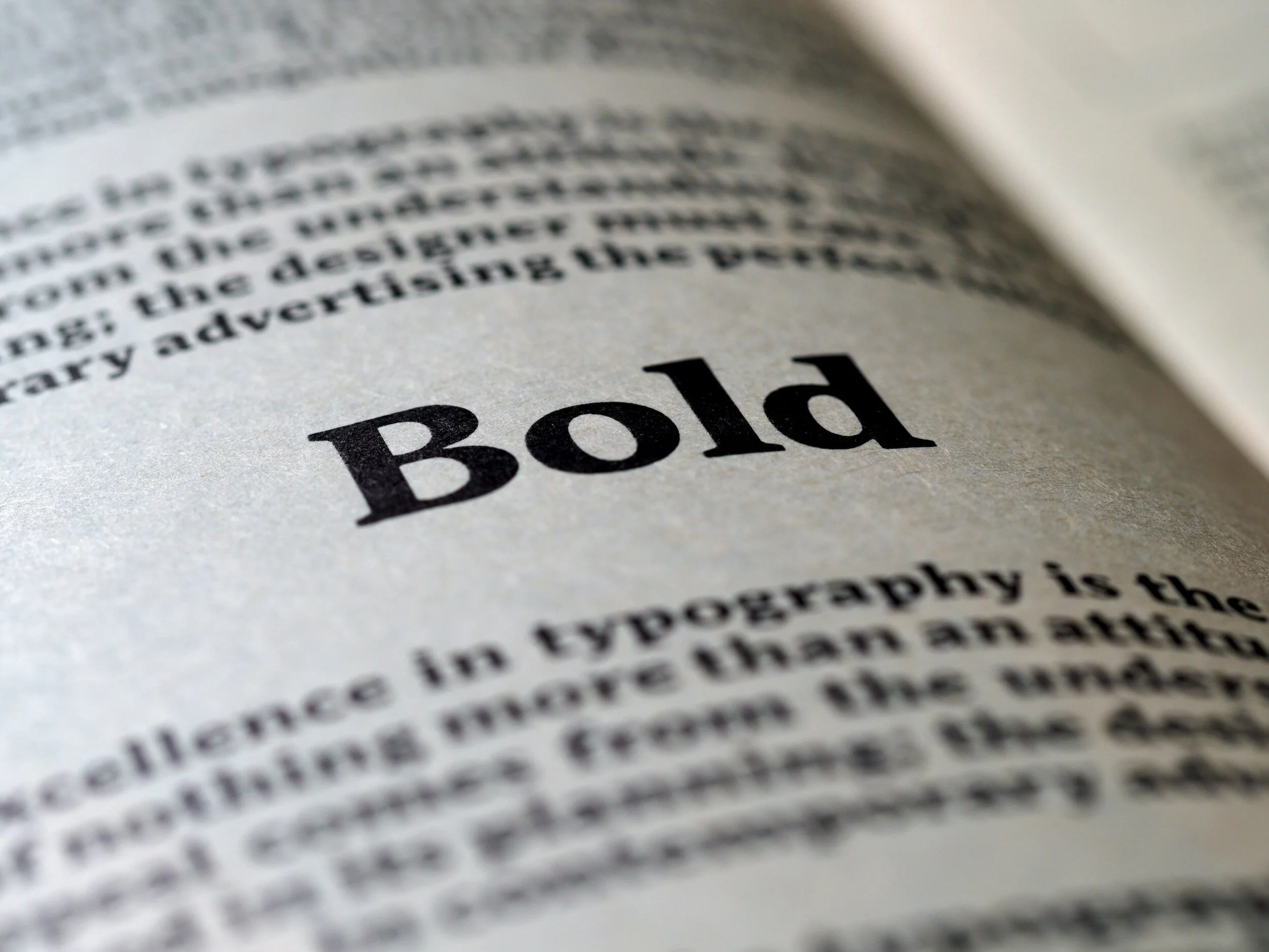
Establishing Hierarchy:
Hierarchy in typography helps guide the reader through the content, emphasizing key elements and creating a sense of order. Use a combination of font size, weight, and style to establish hierarchy. Headings and subheadings should be distinct from body text, making it easy for users to scan and understand the content at a glance. Consistent use of hierarchy not only improves readability but also contributes to a polished and professional appearance.
Whitespace and Line Spacing:
Adequate whitespace and proper line spacing are essential for a comfortable reading experience. Ensure that there is enough space between lines and paragraphs to prevent text from feeling cramped. Whitespace helps to separate different elements on the page and allows the user to focus on the content without feeling overwhelmed. Pay attention to the balance between text and whitespace to create a visually pleasing layout.
Responsive Typography:
With the increasing variety of devices used to access websites, responsive design is crucial. Ensure that your typography adapts seamlessly to different screen sizes. Use relative units like percentages or ems instead of fixed pixel sizes to allow text to scale appropriately. Test your website on various devices to ensure that the typography remains legible and aesthetically pleasing across different platforms.
Color and Contrast:
The color of your text and its contrast with the background are pivotal for readability. High contrast between text and background enhances legibility, making it easier for users to read content. Consider the color scheme of your website and choose text colors that not only align with your brand but also provide optimal contrast. Experiment with color combinations to find a balance that is both visually appealing and functional.
Consistency Across Pages:
Consistency is key in creating a cohesive user experience. Maintain a consistent typographic structure across all pages of your website. This includes using the same fonts, sizes, and styles for headings, subheadings, and body text. Consistency helps users navigate your site effortlessly and reinforces your brand identity.
Conclusion:
In the intricate world of web design, the importance of a well-crafted typographic structure cannot be overstated. Typography influences how users perceive and interact with your website, affecting both aesthetics and functionality. By carefully selecting fonts, establishing hierarchy, optimizing for responsiveness, and maintaining consistency, you can create a visually appealing and user-friendly website that leaves a lasting impression on visitors. Paying attention to the nuances of typography is a small yet powerful investment that can significantly enhance the overall quality of your online presence.